Steppers
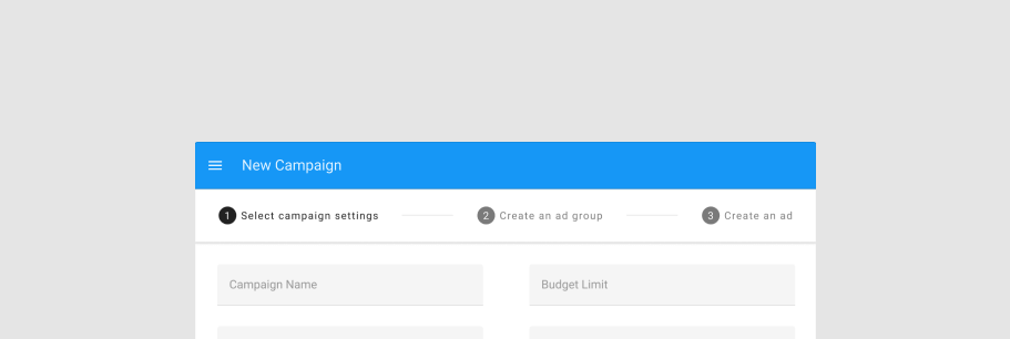
The v-stepper component displays progress through numbered steps.
TIP
This feature was introduced in v3.4.0 (Blackguard)
Usage
A stepper can be used for a multitude of scenarios, including shopping carts, record creation and more.
WARNING
Due to the massive differences in display and functionality between horizontal and vertical steppers, the vertical property is moving to a new component v-stepper-vertical.
API
| Component | Description |
|---|---|
| v-stepper | Primary Component |
| v-stepper-actions | Actions for stepper |
| v-stepper-header | Container for stepper items |
| v-stepper-item | Primary Component |
| v-stepper-window | Window container for stepper window items |
| v-stepper-window-item | Items for stepper window |
Anatomy
The recommended placement of elements inside of v-stepper is:
- Place
v-stepper-headeron top - Place
v-stepper-windowor other forms of content below the stepper header - Place
v-stepper-actionsafter the stepper window

| Element / Area | Description |
|---|---|
| 1. Container | The Stepper container holds all v-stepper components and is composed of 3 major parts: v-stepper-header, v-stepper-window, and v-stepper-actions. |
| 2. Header | The header is the container for the v-stepper-item components. |
| 3. Window | The window is the container for the v-stepper-window-item components. |
| 4. Actions (optional) | A content area that typically contains one or more v-btn components |
Guide
The v-stepper component provides a linear progression process for gathering and displaying information to a user, similar to a form wizard.
Props
The v-stepper component has multiple props to customize its visual appearance and functionality.
Non editable steps
A basic stepper has non-editable steps that force a user to move linearly through your process.
Editable steps
An editable step can be selected by a user at any point and will navigate them to that step.
Alternate label
Steppers also have an alternative label style which places the title under the step itself.
Linear steppers
Linear steppers will always move a user through your defined path.
Optional steps
An optional step can be called out with sub-text.
Items
The stepper component accepts an array of items similar to other components such as v-list and v-select.
WARNING
If no value is provided, the stepper will assign a value based off of its index + 1
Mobile
Use the mobile prop to hide the title and subtitle of the v-stepper-item component.
Errors
An error state can be displayed to notify the user of some action that must be taken.
Dynamic steps
Steppers can have their steps dynamically added or removed. If a currently active step is removed, be sure to account for this by changing the applied model.
Alternative label with errors
The error state can also be applied to the alternative label style.
Non linear
Non-linear steppers allow the user to move through your process in whatever way they choose.