Banners
The v-banner component is used as a middle-interrupting message to the user with one to two actions.

Usage
Banners come in two variations single-line and multi-line (implicit). These can have icons and actions that you can use with your message.
API
| Component | Description |
|---|---|
| v-banner | Primary Component |
| v-banner-text | Sub-component used to display the v-banner subtitle. Wraps the #text slot |
| v-banner-actions | Sub-component that modifies the default styling of v-btn. Wraps the #actions slot |
Anatomy
The recommended placement of elements inside of v-banner is:
- Place a
v-banner-avatarorv-banner-iconon the far left - Place
v-banner-textto the right of any visual content - Place
v-banner-actionsto the far right of textual content, offset bottom
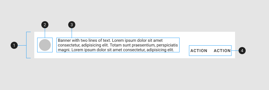
| Element / Area | Description |
|---|---|
| 1. Container | The Banner container holds all v-banner components |
| 2. Avatar / Icon (optional) | Leading media content intended to improve visual context |
| 3. Text | A content area for displaying text and other inline elements |
| 4. Actions (optional) | A content area that typically contains one or more v-btn components |
Examples
Props
Lines
The prop lines can be used to specify how the displayed text should be handled based on its length.
Sticky
You can optionally turn on the sticky prop to ensure that the content is pinned to the top of the screen.
Slots
Actions
Banners may have one or two text buttons that don't stand out that much.
Icon
The icon slot allows you to to explicitly control the content and functionality within it.
Prepend
The prepend slot allows you to to explicitly control the content and functionality within it. Icons also help to emphasize a banner's message.