Cards
The v-card component is a versatile and enhanced version of v-sheet that provides a simple interface for headings, text, images, icons, and more.
Usage
The v-card component is a stylish way to wrap different types of content; such as tables, images, or user actions.
API
| Component | Description |
|---|---|
| v-card | Primary Component |
| v-card-item | Sub-component used to wrap the Card's v-card-title and v-card-subtitle components. |
| v-card-title | Sub-component used to display the Card's title. Wraps the #title slot |
| v-card-subtitle | Sub-component used to display the Card's subtitle. Wraps the #subtitle slot. |
| v-card-text | Sub-component used to display the Card's text. Wraps the #text slot. |
| v-card-actions | Sub-component that modifies the default styling of v-btn. Wraps the #actions slot |
Anatomy
The recommended placement of elements inside of v-card is:
- Place
v-card-title,v-card-subtitleor other title text on top - Place
v-card-textand other forms of media below the card header - Place
v-card-actionsafter card content
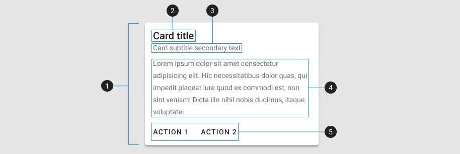
| Element / Area | Description |
|---|---|
| 1. Container | The Card container holds all v-card components. Composed of 3 major parts: v-card-item, v-card-text, and v-card-actions |
| 2. Title (optional) | A heading with increased font-size |
| 3. Subtitle (optional) | A subheading with a lower emphasis text color |
| 4. Text (optional) | A content area with a lower emphasis text color |
| 5. Actions (optional) | A content area that typically contains one or more v-btn components |
Guide
The v-card component is a versatile and enhanced sheet of paper that provides a simple interface for headings, text, images, and actions. It is a content container that is the most common way to present information.
Basics
There are three ways you can populate a v-card with content. The first one is by using props, the second one is by slots, and the third one is by manually using the v-card-* components.
Props give you an easy interface to display text-only content. They can also be used to easily render images and icons. Use slots if you need to render more complex content. If you need full control over the content, use markup.
Combined
In some cases it is possible to combine the different options, like the example below where props, slots and markup have all been used.
INFO
In general slots take precedence over props. So if you provide both text prop and use text slot, then only the slot content will be rendered.
Props
The v-card component has a variety of props that allow you to customize its appearance and behavior.
Variants
The variant prop gives you easy access to several different card styles. Available variants are: elevated(default), flat, tonal, outlined, text, and plain.
| Value | Description |
|---|---|
| elevated | Elevates the card with a shadow |
| flat | Removes card shadow and border |
| tonal | Background color is a lowered opacity of the color |
| outlined | Applies a thin border and card has zero elevation |
| text | Removes the background and removes shadow |
| plain | Removes the background and lowers the opacity until hovered |
Color
Cards can be colored by using any of the builtin colors and contextual names using the color prop.
Elevation
The elevation property provides up to 24 levels of shadow depth. By default, cards rest at 2dp.
Hover
When using the hover prop, the cards will increase its elevation when the mouse is hovered over them.
Href
The card becomes an anchor with the href prop.
Link
Add the link prop for the same style without adding an anchor.
Disabled
The disabled prop can be added in order to prevent a user from interacting with the card.
Image
Apply a specific background image to the Card.
TIP
v-card does not allow its content to overflow outside the card by default. It also establishes a z-index stacking context, which prevents its content from displaying on top of elements outside the v-card, even when it sets a higher z-index value. To override this default behavior, apply the following usage: <v-card style="overflow: initial; z-index: initial">.
Slots
The v-card component provides slots that enable you to customize content created by its props or to add additional content.
Slots give you greater control to customize the content of the v-card component while still taking advantage of the easy-to-use props.
Avatar and icon
You can use the prepend-avatar, append-avatar, prepend-icon and append-icon props or the prepend and append slots to place a v-icon that automatically injects the designated icon.
Examples
The following are a collection of examples that demonstrate more advanced and real world use of the v-card component.
Card Reveal
Using v-expand-transition and a @click event you can have a card that reveals more information once the button is clicked, activating the hidden card to be revealed.
Content wrapping
The v-card component is useful for wrapping content.
Custom actions
With a simple conditional, you can easily add supplementary text that is hidden until opened.
Grids
Using grids, you can create beautiful layouts.
Horizontal cards
You can also play with the card layout using layout flex.
Information card
Cards are entry points to more detailed information. To keep things concise, ensure to limit the number of actions the user can take.
Media with text
Using the layout system, we can add custom text anywhere within the background.
Twitter card
The v-card component has multiple children components that help you build complex examples without having to worry about spacing. This example is comprised of the v-card-title, v-card-text and v-card-actions components.
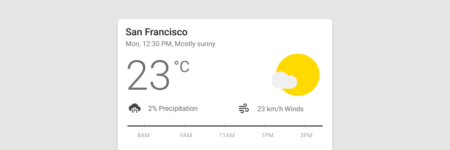
Weather card
Using v-list-items and a v-slider, we are able to create a unique weather card. The list components ensure that we have consistent spacing and functionality while the slider component allows us to provide a useful interface of selection to the user.
Loading
Use an indeterminate v-progress-linear to indicate a loading state.
Earnings goal
This example utilizes slots to customize the appearance of the different content areas.
Funding card
Utilize a combination of Card properties and utility classes to create a unique funding card.