Avatars
The v-avatar component is typically used to display circular user profile pictures. This component will allow you to dynamically size and add a border radius of responsive images, icons, and text. When rounded prop set to 0 will display an avatar without border radius.
Usage
Avatars in their simplest form display content within a circular container.
API
| Component | Description |
|---|---|
| v-avatar | Primary Component |
Anatomy
The recommended placement of elements inside of v-avatar is:
- Place a v-img or v-icon component within the default slot
- Place textual content within the default slot
| Element / Area | Description |
|---|---|
| 1. Container | The Avatar container that typically holds a v-icon or v-img component |
Examples
Props
Size
The size prop allows you to change the height and width of the avatar.
Tile
The rounded prop can be used to remove the border radius from v-avatar leaving you with a simple square avatar.
Slots
Default
The v-avatar default slot allows you to render content such as v-icon components, images, or text. Mix and match these with other props to create something unique.
Misc
Advanced usage
Combining an avatar with other components allows you to build beautiful user interfaces right out of the box.
Another example combining avatar with menu.
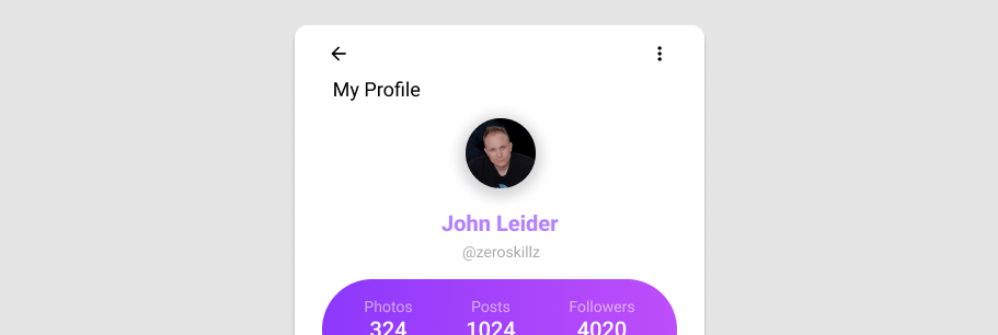
Profile Card
Using the rounded prop value 0, we can create a sleek hard-lined profile card.