App bars
The v-app-bar component is pivotal to any graphical user interface (GUI), as it generally is the primary source of site navigation.
Usage
The v-app-bar component is used for application-wide actions and information.
API
| Component | Description |
|---|---|
| v-app-bar | Primary Component |
| v-app-bar-nav-icon | A customized v-btn component that uses a default icon value of $menu |
| v-app-bar-title | An extension of v-toolbar-title that is used for scrolling techniques |
TIP
The app-bar component works great in conjunction with a v-navigation-drawer for providing site navigation in your application.
Anatomy
The recommended placement of elements inside of v-app-bar is:
- Place
v-app-bar-nav-iconor other navigation items on the far left - Place
v-app-bar-titleto the right of navigation - Place contextual actions to the right of navigation
- Place overflow actions to the far right
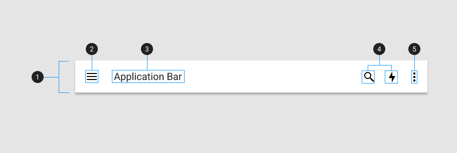
| Element / Area | Description |
|---|---|
| 1. Container | The App Bar container holds all v-app-bar components |
| 2. App Bar Icon (optional) | A styled icon button component created that is often used to control the state of a v-navigation drawer |
| 3. Title (optional) | A heading with increased font-size |
| 4. Action items (optional) | Used to highlight certain actions not in the overflow menu |
| 5. Overflow menu (optional) | Place less often used action items into a hidden menu |
WARNING
When a v-btn with the icon prop is used inside of v-toolbar and v-app-bar they will automatically have their size increased and negative margin applied to ensure proper spacing according to the Material Design Specification. If you choose to wrap your buttons in any container, such as a div, you will need to apply negative margin to that container in order to properly align them.
Examples
The following are a collection of examples that demonstrate more advanced and real world use of the v-app-bar component.
Props
The v-app-bar component has a variety of props that allow you to customize its look and feel, density, scroll behavior, and more.
Scroll behavior
Available values:
- hide: The default slot area will shift up and hide as the user scrolls down. The extension slot remains visible.
- collapse: Shrink horizontally to a small bar in one corner.
- elevate: Add a drop shadow to the app bar when scrolling. Ignores
scroll-threshold, will always be applied with any amount of scrolling. - fade-image: Fade out the image as the user scrolls down.
- inverted: Has no effect on its own, but will reverse the behavior when combined with any other option.
The scroll-threshold prop is used to determine how far the user must scroll down (in pixels) before the behavior is applied.
A scroll listener is added to window by default, but can be changed to a custom element using the scroll-target prop.
Density
You can make app-bar dense. A dense app bar has lower height than regular one.
Images
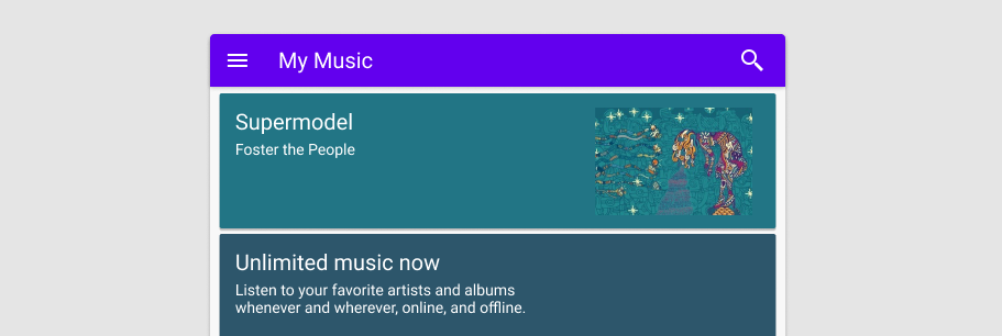
v-app-bar can contain background images. You can set source via the image prop. If you need to customize the v-img properties, the app-bar provides you with an image slot.
Prominent
An v-app-bar with the density="prominent" prop can opt to have its height shrunk as the user scrolls down. This provides a smooth transition to taking up less visual space when the user is scrolling through content. Shrink height has 2 possible options, compact (48px) and comfortable (56px) sizes.