Alerts
The v-alert component is used to convey important information to the user through the use of contextual types, icons, and colors.

Usage
An alert is a v-sheet that specializes in getting the user's attention. While similar to v-banner in functionality, v-alert is typically inline with content and used multiple times throughout an application.
API
| Component | Description |
|---|---|
| v-alert | Primary Component |
| v-alert-title | Sub-component used to display the v-alert title. Wraps the #title slot |
Anatomy
The recommended placement of elements inside of v-alert is:
- Place a
v-iconon the far left - Place
v-alert-titleto the right of the contextual icon - Place textual content below the title
- Place closing actions to the far right
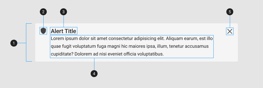
| Element / Area | Description |
|---|---|
| 1. Container | The Alert container holds all v-alert components |
| 2. Icon | An icon that correlates to the contextual state of the alert; success, info, warning, error |
| 3. Title | A heading with increased font-size |
| 4. Text | A content area for displaying text and other inline elements |
| 5. Close Icon (optional) | Used to hide the v-alert component |
Guide
The v-alert component is a callout element designed to attract the attention of a user. Unlike v-banner, the v-alert component is intended to be used and re-used throughout your application. An alert's color is derived from its type property which corresponds to your application's contextual theme colors and iconfont aliases.
Props
In addition to the standard v-sheet properties such as elevation, dimension, and border-radius, the v-alert component supports v-model, variants, and density.
Content
The v-alert component supports simple content using the title and text props. This approach is best for strings that do not need custom styling.
The following code snippet is an example of a basic v-alert component only containing text:
<v-alert text="Lorem ipsum dolor sit amet consectetur adipisicing elit. Commodi, ratione debitis quis est labore voluptatibus..."></v-alert>Adding a title is as easy as defining its value. The next example adds a string title to accompany the content text:
Notice how the alert does not have a color or icon. This is defined using the type property.
Type
Alerts have 4 contextual states: success, info, warning, and error. Each state has a default color and icon associated with it. When a type is not provided, the v-alert component defaults to a greyish background.
With a basic alert rendered, add your choice of contextual type. The following example puts the v-alert component in a success state:
Type reference
| Type | Color | Icon alias | Icon |
|---|---|---|---|
| Success | success | $success | |
| Info | info | $info | |
| Warning | warning | $warning | |
| Error | error | $error |
Color and icon
The type property acts as a shorthand for a color and icon combination, you can use both props individually to achieve the same effect. The following example produces the same result as using type="success" by defining a custom color and using the icon lookup table to get the globally defined success icon:
<v-alert
  color="success"
  icon="$success"
  title="Alert title"
  text="Lorem ipsum dolor sit amet consectetur adipisicing elit. Commodi, ratione debitis quis est labore voluptatibus..."
></v-alert>
Density
The v-alert component has the ability to reduce its height in intervals using the density prop. This is useful when you need to reduce the vertical space a component needs. The following example reduces the vertical space by using density="compact":
The density prop supports 3 levels of component height; default, comfortable, and compact.
Variants
The v-alert has 6 style variants, elevated, flat, tonal, outlined, text, and plain. By default, the v-alert component is flat; which means that it has a solid background and no box-shadow (elevation). The following example modifies the overall styling of the alert with a custom variant:
Closable
The closable prop adds a v-icon on the far right, after the main content. This control hides the v-alert when clicked, setting it's internal model to false. Manually control the visibility of the alert by binding v-model or using model-value. The following example uses a dynamic model that shows and hides the v-alert component:
The close icon automatically applies a default aria-label and is configurable by using the close-label prop or changing close value in your locale.
INFO
For more information on how to global modify your locale settings, navigate to the Internationalization page.
Additional Examples
The following is a collection of v-alert examples that demonstrate how different the properties work in an application.
Border color
The border-color prop removes the alert background in order to accent the border prop. If a type is set, it will use the type's default color. If no color or type is set, the color will default to the inverted color of the applied theme (black for light and white/gray for dark).
Icon
The icon prop allows you to add an icon to the beginning of the alert component. If a type is provided, this will override the default type icon. Additionally, setting the icon prop to false will remove the icon altogether.
Outlined
The outlined prop inverts the style of an alert, inheriting the currently applied color, applying it to the text and border, and making its background transparent.
Accessibility
By default, v-alert components are assigned the WAI-ARIA role of alert which denotes that the alert "is a live region with important and usually time-sensitive information." When using the closable prop, the close icon will receive a corresponding aria-label. This value can be modified by changing either the close-label prop or globally through customizing the Internationalization's default value for the close property.