Infinite scrollers
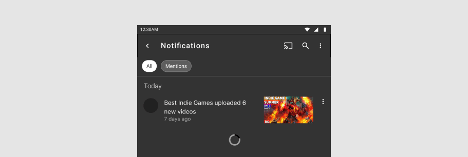
The v-infinite-scroll component displays a potentially infinite list, by loading more items of the list when scrolling. It supports either vertical or horizontal scrolling.
TIP
This feature was introduced in v3.4.0 (Blackguard)
Usage
When scrolling towards the bottom, new items will be rendered either automatically, or manually with the click of a button.
A load event will be emitted when the component needs to load more content. The argument passed is an object with two properties.
sidetells you on which side new content should be added, either at the'start'or'end'. The return value of the function is a string that describes if the new content was loaded successfully or not.doneis a callback function that should be called when the loading of new content is done. It takes a single parameterstatusthat describes if the load was successful or not. See the table below for the possible values.
| Status | Description |
|---|---|
'ok' | Content was added succesfully |
'error' | Something went wrong when adding content. This will display the error slot |
'empty' | There is no more content to fetch. This will display the empty slot |
'loading' | Content is currently loading. This will display a message that the content is loading. This status is only set internally by the component and should not be used with the done function |
API
| Component | Description |
|---|---|
| v-infinite-scroll | Primary Component |
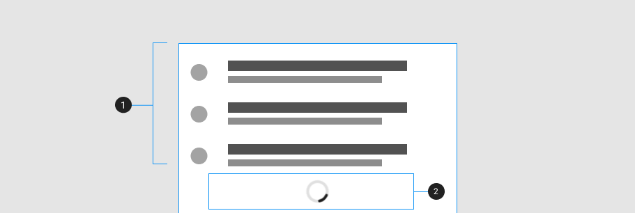
Anatomy
The v-infinite-scroll works with any content in its default slot.
| Element / Area | Description |
|---|---|
| 1. Container | The infinite scroller content container |
| 2. Loader | The loader content area |
Guide
The v-infinite-scroll component is a container that allows you to react to a user reaching the end of the content area. It is useful when you need to display an unknown but large number of items, and you don't want to load them all at once.
Props
The v-infinite-scroll component has several props that can be used to customize its behavior.
Mode
The default behavior of the component is to try to load more content automatically when the scrollbar gets close to the end. However, a manual mode is also supported, where the user needs to do some interaction to load the content. By default this is a button, but it can be customized with a slot
Direction
The v-infinite-scroll component can be used with either vertical or horizontal scrolling.
Side
By default, the v-infinite-scroll component assumes that new content will appear at the end of existing content. But it also supports content being added to the start and appearing both at the beginning and the end.
When using the start side for content, the scrollbar will start at the bottom of the content.
When using both sides for content, the scrollbar will start in the middle of the content.
Color
The default load more button and loading spinner can be colored with the color prop.
Slots
The v-infinite-scroll component exposes several slots that allow you to further customize its behaviour.

| Element / Area | Description |
|---|---|
| 1. Container | The default slot |
| 2. Load-more | The slot shown when the mode is set to manual and the status is not loading |
| 3. Loading | The slot is shown when the mode is set to manual and status is loading |
| 4. Empty | The slot shown when the status is empty |
| 5. Error | The slot is shown when the status is error |
Loading
You can customize the loading message with the loading slot.
Load more
When using manual mode you can customize the action required to load more content with the load-more slot.
Empty
You can customize the empty message with the empty slot.
Error
The error slot is shown if the status 'error' is returned from the done callback.
Examples
The following is a collection of examples that demonstrate more advanced and real-world use of the v-infinite-scroll component.
Virtualized infinite scroller
If the items in your infinite list are of a uniform size, you can quite easily virtualize the list to only render a small number of items regardless of how far you scroll in either direction.