Data iterators
The v-data-iterator component is used for displaying arbitrary data, and shares a majority of its functionality with the v-data-table component. Features include sorting, searching, pagination, and selection.
TIP
This feature was introduced in v3.4.0 (Blackguard)
Usage
The v-data-iterator allows you to customize exactly how to display your data. In this example we are using a grid with cards.
API
| Component | Description |
|---|---|
| v-data-iterator | Primary Component |
Anatomy
The recommended placement of elements inside of a v-data-iterator are:
- Place a v-toolbar or similar component above the main content
- Place content after the header
- Place a v-pagination below the main content
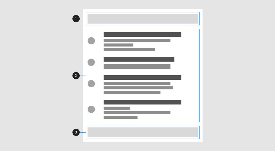
| Element / Area | Description |
|---|---|
| 1. Header (optional) | The header is used to display a title and actions |
| 2. Container | The container is the root element of the component |
| 3. Footer (optional) | The footer is used to display pagination |
Guide
The v-data-iterator component is used for displaying data, and shares a majority of its functionality with the v-data-table component. Features include sorting, searching, pagination, and selection.
The following code snippet is an example of a basic v-data-iterator component:
<v-data-iterator :items="[1, 2, 3, 4, 5]">
  <template v-slot:default="{ items }">
    <v-list-item
      v-for="(item, i) in items"
      :key="i"
      :title="`Item ${i}`"
    ></v-list-item>
  </template>
</v-data-iterator>
Examples
The following are a collection of examples that demonstrate more advanced and real world use of the v-data-iterator component.
Slots
The v-data-iterator component has 4 main slots
Default
The v-data-iterator has internal state for both selection and expansion, just like v-data-table. In this example we use the methods isExpanded and toggleExpand available on the default slot.
Header and footer
The v-data-iterator has both a header and footer slot for adding extra content.
Controllable props
Sorting, filters and pagination can be controlled externally by using the individual props
Loader props
Loader can be used to change loader on "loading" prop